https://www.w3school.com.cn/cssref
CSS stands for Cascading Style Sheets
h1 {
    color: navy;
}
rel="stylesheet" → 说明链接的文件是样式表。
type="text/css" → 指明文件类型(CSS),HTML5 可以省略。
<!DOCTYPE html>
<html>
<head>
<link rel="stylesheet" type="text/css" href="/css/mystyle.css">
<style>
h1 {
  color: orange;
}

</style>
</head>
<body>


<h1>这是一个标题</h1>
<p>本文档的样式是外部样式表和内部样式的组合。</p>

<hr>

<p>如果内部样式是在链接到外部样式表之后定义的,则 <code><h1> <code/>元素将是橙色:</p>
</body>
</html>
CSS 层叠 & 继承 & 优先级
<!DOCTYPE html>
<html lang="en">
<head>
  <meta charset="UTF-8">
  <title>CSS 层叠 & 继承 & 优先级</title>
  <style>
    body {
      font-family: Arial;
      color: gray; /* 会被子元素继承 */
    }

    p {
      color: green; /* 比继承的 gray 更具体 */
    }

    .highlight {
      color: blue; /* 类选择器优先级比标签选择器高 */
    }

    #special {
      color: red; /* ID 选择器优先级比类选择器高 */
    }

    p {
      color: purple; /* 同一选择器,后写的覆盖前写的 */
    }
  </style>
</head>
<body>
  <p>普通段落(继承 body → 但被 p 的 purple 覆盖)</p>
  <p class="highlight">带类的段落(blue)</p>
  <p id="special" class="highlight">带 ID 的段落(red)</p>
</body>
</html>
一个应用:
<!DOCTYPE html>
<html lang="en">
<head>
    <meta charset="UTF-8">
    <meta name="viewport" content="width=device-width, initial-scale=1.0">
    <title>What is a "labubu"</title>
    <style>
        body{
            font-family: Arial, sans-serif; /* 用body设置大部分字体的样式 */
            margin: 20px;
            line-height: 1.6;
            font-size: 18px;
            color: #333;
        }
        em{
            font-style: normal;
        }
        .header{
            font-size: 24px;
            margin-bottom: 10px;
            color:blueviolet;
            text-decoration: underline;
        }
        .header em{
            color:blue;
            text-decoration: none;
        }
    </style>
</head>
<body>
    <h2 class="header"><em>'Labubu'</em> is a plush toy that is causing a [[frenzy]]. <em>Here's its origin story</em></h2>

    <p>Jun 18, 2025 — It's <strong>a plush doll</strong>. It's a bag [[charm]].
         It's a collectible that recently sold for six figures.
         But no, this wildly popular creature isn't a Gremlin or one of the monsters in Maurice Sendak's children's classic Where the Wild Things Are.
     </p>
     <p> https://www.npr.org › 2025/06/18 › what-is-labubu-po...</p>
</body>
</html>
伪类
Pseudo-class
CSS伪类是用来添加一些选择器的特殊效果。
What are CSS Pseudo-classes?
Pseudo-classes in CSS act as conditions for applying styles to HTML elements. These styles are triggered when certain conditions are met, such as an element’s position in the document, its state (like being hovered over), or based on the user’s interaction history (like visiting links).
not
CSS :not() 伪类用于匹配任何不是指定元素/选择器的元素。
<!DOCTYPE html>
<html>
<head>
<style>
p {
  color: black;
}

:not(p) {
  color: red;
}
</style>
</head>
<body>

<h1>:not 示例</h1>

<p>这是一个段落。</p>
<p>这是另一个段落。</p>

<div>这是 div 元素中的一些文本。</div>

<a href="https://www.w3school.com.cn" target="_blank">链接到 W3School!</a>

</body>
</html>
root
CSS :root 伪类用于匹配文档的根元素。
在 HTML 中,根元素始终是 <html> 元素。
<!DOCTYPE html>
<html lang="en">
<head>
    <meta charset="UTF-8">
    <meta name="viewport" content="width=device-width, initial-scale=1.0">
    <title>psedo-class</title>
    <style>
        :root {
            background-color: cadetblue;
            padding: 30px; /* 为文档的根元素设置背景颜色和内边距: */
        }
    </style>
</head>

<body>
</body>
</html>
CSS 伪元素
CSS 伪元素用于设置元素特定部分的样式。
例如,它可以用于:
- 设置元素的第一个字母或第一行的样式
- 在元素内容之前或之后插入内容
- 设置列表项标记的样式
- 设置对话框背景视图的样式
CSS 伪元素是一种特殊的选择器,它可以在不改变 HTML 结构的情况下对页面元素的特定部分进行样式设置。
CSS 伪元素是用来添加一些选择器的特殊效果。
常用的 CSS 伪元素有 ::before、::after、::first-line、::first-letter 等。
CSS ::before 伪元素
CSS ::before 伪元素用于在指定元素的内容之前插入一些内容。
使用 content 属性指定要插入的内容。content 的值可以是:
- 字符串:content: “Hello world!”;
- 图片:content: url(myimage.jpg);
- 无内容:content: none;
- 计数器:content: counter(li);
- 引号:content: open-quote;
- 属性值:content: ” (” attr(href) ”)”;
提示:请注意,插入的内容仍然位于指定元素内部。插入的内容会添加到元素内部的其他内容之前。
使用 ::after 在特定元素的内容之后插入一些内容。
在每个 <p> 元素的内容之前插入一个字符串:
<!DOCTYPE html>
<html>
<head>
<style>
p::before {
  content: "阅读此内容 -";
}
</style>
</head>
<body>

<h1>::before 演示</h1>

<p>我的名字是唐老鸭。</p>
<p>我住在鸭堡。</p>

</body>
</html>
使用 target
https://www.w3school.com.cn/cssref/selector_target.asp
给出超链接,与 display配合使用(隐藏内容),可以制作出点击超链接显示内容的作用。
<!DOCTYPE html>
<html lang="en">
<head>
    <meta charset="UTF-8">
    <meta name="viewport" content="width=device-width, initial-scale=1.0">
    <title>Document</title>
    <style>
        .tab div {
            display: none;
        }

        .tab div:target {
            display: block;
            border: 2px solid darkorange;
            background-color: beige;
        }
        /*
        选择位于 class="tab" 元素内部的 div 元素,
        且该 div 当前是 URL 片段(fragment)匹配的目标(:target)*/

    </style>
</head>
<body>
    <h1>:target 演示</h1>

<div class="tab">

    <a href="#link1">链接 1</a>
    <a href="#link2">链接 2</a>
    <a href="#link3">链接 3</a>

    <div id="link1">
        <h3>链接 1 的内容</h3>
        <p>你好,世界!</p>
    </div>

    <div id="link2">
        <h3>链接 2 的内容</h3>
        <h4>非常成功!</h4>
    </div>

    <div id="link3">
        <h3>链接 3 的内容</h3>
        <p>耶!</p>
    </div>

</div>
</body>
</html><!DOCTYPE html>
<html lang="en">
<head>
<meta charset="UTF-8">
<meta name="viewport" content="width=device-width, initial-scale=1.0">
<title>Target demo 02</title>
<style type="text/css">
:target{
display: block;
background-color: aquamarine;
}
/*单独设置id为news的target属性*/
#news1:target {/*与 <p id="news1"> 对应,当 URL 为 ...#news1 时生效*/
display: block;
background-color: aquamarine;
}
a{
display: inline-block;
}
/*隐藏段落和列表*/
/*p#news1 { display: none; } 的选择器(含 ID)的优先级比 :target 伪类高*/
p#news1 {
display: none;
background-color: blueviolet;
}
dl{
display: none;
}
</style>
</head>
<body>
<a href="#news1">跳转此内容 p</a>
<p><a href="#list1">跳转此内容 dl</a></p>
<hr>
<br><br><br><br><br><br><br>
<p id="news1">content........</p>
<dl id="list1">
<dd>list content........</dd>
<dd>list content........</dd>
<dd>list content........</dd>
<dd>list content........</dd>
</dl>
</body>
</html>CSS Float
CSS 的 Float(浮动),会使元素向左或向右移动,其周围的元素也会重新排列。
Float(浮动),往往是用于图像,但它在布局时一样非常有用。
清除 float
<!DOCTYPE html>
<html lang="en">
<head>
    <meta charset="UTF-8">
    <meta name="viewport" content="width=device-width, initial-scale=1.0">
    <title>CSS float 02</title>
    <style>
        .father{
            background-color: lightgray;
            border: 1px solid black;
        }
        .box1, .box2, .box3{
            height: 50px;
            line-height: 40px;
            border:1px dashed blanchedalmond;
            margin: 10px;
            padding: 5px;
            /* float 属性使元素浮动 */
            float: left;
        }


        p{
            border: 1px dashed blue;
            margin: 10px;
            padding: 5px;
            background-color: thistle;
        }
    </style>
</head>

<body>

    <div class="father">
        <div class="box1" style="background-color: aquamarine;" >
            Box 1
        </div>
        <div class="box2" style="background-color: rgb(232, 19, 126);">
            Box 2
        </div>
        <div class="box3" style="background-color: rgb(39, 23, 255);">
            Box 3
        </div>


    </div>
</body>
</html>浮动的元素会脱离普通文档流(normal flow),也就是说:
.box1、.box2、.box3这些元素虽然视觉上还在.father里面;- 但从 布局计算的角度,它们已经不再“占据”
.father的空间。
于是,.father内部“没有内容”了,它的高度就变成了 0,只剩下边框那一条线。
解决1:
<style>

.clearFloat{
	clear: both; /* 清除浮动,确保段落在浮动元素下方显示;只能清除左右浮动 */
}

</style>

<body>

    <div class="father">
        <div class="box1" style="background-color: aquamarine;" >
            Box 1
        </div>
        <div class="box2" style="background-color: rgb(232, 19, 126);">
            Box 2
        </div>
        <div class="box3" style="background-color: rgb(39, 23, 255);">
            Box 3
        </div>


        <div class="clearFloat">

        </div>

    </div>
</body>
第二种方法:
在被影响元素的父标签中设置overflow属性
.father{
		background-color: lightgray;
		border: 1px solid black;
		overflow: hidden;
}
第三种方法:使用after伪对象
.father::after{
	content: ""; /* 必须有内容,可以是空字符串 */
	display: block; /* 使伪元素成为块级元素 */
	clear: both; /* 清除浮动 */
	visibility: hidden;
	height: 0; /* 不占用空间 */
}
伪元素:
| pseudo-element | meaning | description |
|---|---|---|
| ::after | 元素内容后面 | 在元素内容后插入内容 |
| 代码 | 作用 |
|---|---|
content: "" | 伪元素必须有内容才能生成。哪怕是空字符串。 |
display: block | 让这个伪元素成为“块级元素”,才能参与清除浮动。 |
clear: both | 表示清除左浮动和右浮动的影响,强制出现在所有浮动元素之后。 |
visibility: hidden | 让这个清除浮动的伪元素不可见。 |
height: 0 | 防止它占用任何可见空间。 |
/* 简写写法 */
.clearfix::after {
  content: "";
  display: table;
  clear: both;
}
margin 塌陷问题
CSS position 相对定位和绝对定位
原文:(https://www.runoob.com/w3cnote/css-position-static-relative-absolute-fixed.html)
一、position 的四个值:static、relative、absolute、fixed。
绝对定位:absolute 和 fixed 统称为绝对定位
相对定位:relative
默认值:static
二、relative定位与absolute定位的区别
<div class="box01">box01box01box01box01box01</div>
<div class="box02">box02box02box02box02box02</div>
<div class="box03">box03box03box03box03box03</div>
<div class="box04">box04box04box04box04box04</div>
<div class="box05">box05box05box05box05box05</div>.box01{
height: 100px;
background-color: lightcoral;
}
.box02{
height: 100px;
background-color: lightseagreen;
}
.box03{
height: 100px;
background-color: lightblue;
}
.box04{
height: 100px;
background-color: lightgreen;
}
.box05{
height: 100px;
background-color: lightpink;
}初始效果:
postition-flow1-original
相对定位
元素相对于原来位置偏移,宽高都没变,撑大了容器。
注意开启相对定位的元素,不会脱离文档流。
Transclude of postition-flow2-relative
.box02{
	height: 100px;
	background-color: lightseagreen;
	position: relative;
	left: 190px;
	top: 20px;
	/*元素相对于原来位置偏移,宽高都没变,撑大了容器。*/
}
这样改,下面的元素不会往上顶。
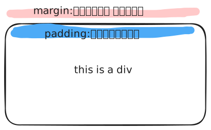
margin and padding